
Why Mobile-First Design Is No Longer Optional for Your Business
23 June, 2026
Table of Contents
Mobile-first design is no longer optional for businesses that want their websites to work well on the devices customers use most.
For years, businesses designed their websites on big screens, for big screens and treated the mobile version as an afterthought, something to “make sure it works” on a phone once the real design was done. That order of priorities is now completely backward. For most businesses today, the phone isn’t the secondary experience. It’s the main one.
The majority of people will encounter your business on a small screen before they ever see it on a desktop, if they see it on a desktop at all. This is especially true across the region, where mobile is how most people browse, shop, and connect. Designing for that reality mobile-first is no longer a nice-to-have. It’s the baseline for a website that actually works.
Mobile-first design helps businesses create websites that feel faster, clearer, and easier to use for people browsing on smaller screens.
What Mobile-First Design Really Means
Mobile-first design isn’t simply making sure your site shrinks to fit a phone. It’s a shift in approach: designing for the smallest screen first, then expanding to larger ones, rather than the other way around.
This matters because designing for mobile first forces good discipline. A phone screen has no room for clutter, so you’re pushed to identify what truly matters, prioritize ruthlessly, and present it clearly. The result tends to be a cleaner, more focused experience on every device not just mobile. When you start with the constraints of a small screen, you usually end up with a better website overall.
Good mobile-first design starts with the most important content and actions, then expands the experience for larger screens.
Your Customers Are Already on Mobile
The behavior is clear and consistent: people reach for their phones first. They search on the move, browse during spare moments, and increasingly complete purchases without ever opening a laptop. If your website is awkward, slow, or hard to use on a phone, you’re not inconveniencing a small minority you’re failing the majority of your visitors.
And the cost is immediate. A frustrating mobile experience doesn’t just annoy people; it sends them straight to a competitor whose site works better on the device in their hand.
In a mobile-heavy market, a poor mobile experience is one of the fastest ways to quietly lose business.
Google Thinks Mobile-First Too
Beyond your customers, the way your business is discovered now depends on mobile. Search engines primarily look at the mobile version of your website when deciding how to rank it. That means a site that performs poorly on phones doesn’t just frustrate visitors it becomes harder to find in the first place.
In practical terms, mobile-first design and being discoverable online are now tied together. Investing in a strong mobile experience improves both how many people find you and how many stay once they do.
This is why mobile-first design is closely connected to search visibility, performance, and the way customers discover your business online.
You can also review Google’s mobile-first indexing guidance from Google Search Central to understand how mobile versions affect search visibility.
What Great Mobile-First Design Looks Like
Getting mobile right comes down to a few principles that consistently separate sites that work from sites that frustrate.
Speed and light pages
Phones often run on slower or metered connections, and patience is short. Fast-loading, lightweight pages aren’t a luxury on mobile they’re essential. Heavy images and bloated code that might be tolerable on desktop become deal-breakers on a phone.
Touch-friendly design
Fingers aren’t mouse pointers. Buttons need to be large enough to tap comfortably, spaced so people don’t hit the wrong one, and placed where thumbs naturally reach. Small, crowded links are a constant source of mobile frustration.
Readable and simple
Text must be comfortable to read without zooming, and layouts should flow in a single, logical column rather than cramming desktop layouts onto a narrow screen. The simpler and clearer the structure, the better it works in someone’s hand.
A strong mobile-first design approach makes speed, readability, navigation, and touch-friendly interactions part of the core website strategy.
You can also read our guide on UX design definition to understand how better user experience supports stronger mobile and website design.
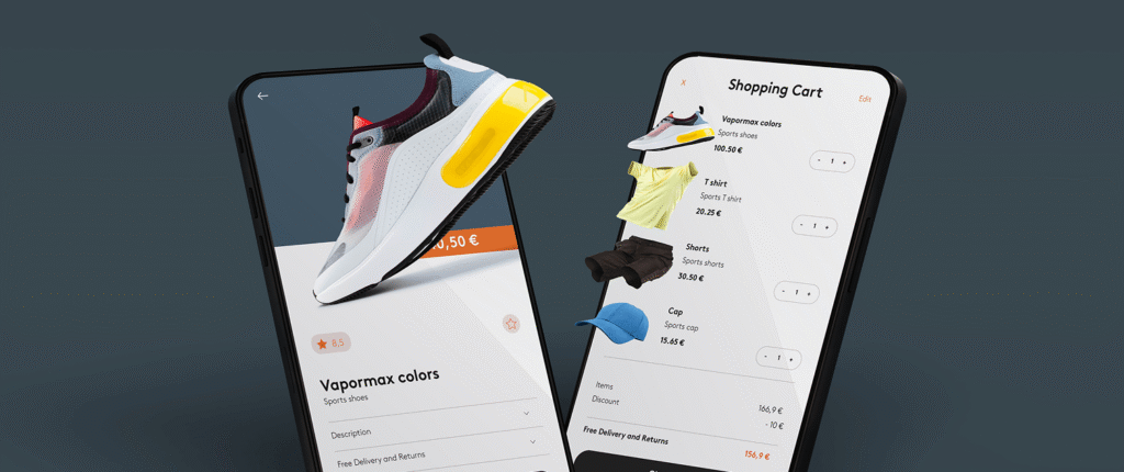
Common Mobile Mistakes That Cost You Customers
Many businesses unknowingly sabotage their mobile experience. Pop-ups that are impossible to close on a small screen, text too small to read, buttons too close together, forms that are painful to fill out with a thumb, and pages that take too long to load all quietly drive customers away. The frustrating part is that visitors rarely complain they simply leave, and you never know how many you lost.
The fix isn’t complicated, but it does require treating mobile as the priority rather than the afterthought. When you design for the phone first and test on real devices, these problems disappear before they ever reach your customers.

Designing for Where Your Customers Actually Are
The way people use the internet has fundamentally changed, and the businesses that thrive are the ones that meet customers where they actually are on their phones, expecting a fast, effortless experience. A mobile-first website isn’t about following a trend. It’s about respecting how your customers behave and making it easy for them to choose you.
If your website was built for the desktop era, it may be quietly costing you the customers who matter most. The good news is that a thoughtful, mobile-first approach can turn that around.
If you’d like to make sure your website works beautifully for every customer on every device, Kudzu.ai designs and builds mobile-first experiences for businesses across Jordan and the region. Explore our services, or get in touch to talk through how your site performs where it matters most.